As part of our blog series based on this great panel of in-house practitioners – featuring Healthpeak Properties’ Carol Samaan, Lumen Technologies’ Michael Rouvina and Cognizant’s Aya Kiy-Morrocco – here’s a blog that addresses the question of: “How much do you think about design when you draft? Do you rely on others more for that type of thing?”
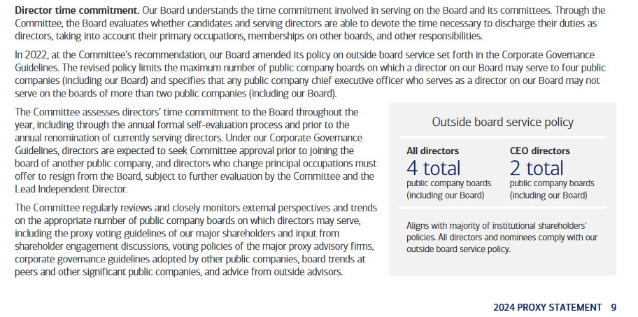
- Healthpeak Properties’ Carol Samaan – I care a lot about the design so I will give a lot of thought to it. Both the visuals that we use in our proxy statement and in the ESG report can really can help tell the story in a way that is appealing and easy to understand. It goes hand-in-hand with plain English disclosure. So having a good chart or graphic can really help reinforce the story you’re trying to tell.
We do care a lot about design and I’ve been known to draw things on a napkin and send it to our external designer and say, “see if you can make this disclosure come out like this.” We also look at a disclosure database that our designer has, and we’ll look at what other companies use and say, “we like this chart or this graphic, let’s see if we can work this in.”
Design is important to us but not at the expense of the disclosure, of course. It really helps enhance the story and that’s how it should be used. - Lumen Technologies’ Michael Rouvina – Design is also front of mind for me when I’m putting together new disclosure. I tend to start with where in the document is this disclosure going to appear. Is it an area that’s already very narrative heavy and just blocks of text? Or is it a page where there’s already a lot of graphical elements. I don’t want it to read like a novel and I don’t want it to read like a picture book. I try to strike some balance between the two.
Like Carol, I have ideas in my mind what I want it to appear like but I’m still creatively challenged, so I engage our vendors to help implement what my vision is and what the vision of others is. We’ve gotten a lot of good feedback over the years, particularly from our retail shareholders.
Just because something appears a certain way online, that doesn’t mean it’s going to look the same way in print. I try to strike the right balance between the two to make sure the font’s readable in both instances. To make sure the colors make sense for who the audience is and where it’s going to appear. - Cognizant’s Aya Kiy-Morrocco – Not being a creative, I do rely on external help to help us with design. One thing we always want to make sure of is that our ESG report fits into the larger disclosures of the company – so we want to make sure that it’s a family of reports. That they look like brother and sister and that they come from the same family. So for the ESG report, we take a lot of pointers from either our proxy or the annual report as we want to make sure that we’re aligned to the general design standards that our Brand team using.
In addition, we’ve been really focused on accessibility in recent years. We want to make sure that our report is ADA compliant. Ensuring the size of the fonts or the colors that we’re using are accessible to everyone. We want to keep digital inclusion in mind when we’re doing this.
